
The Problem
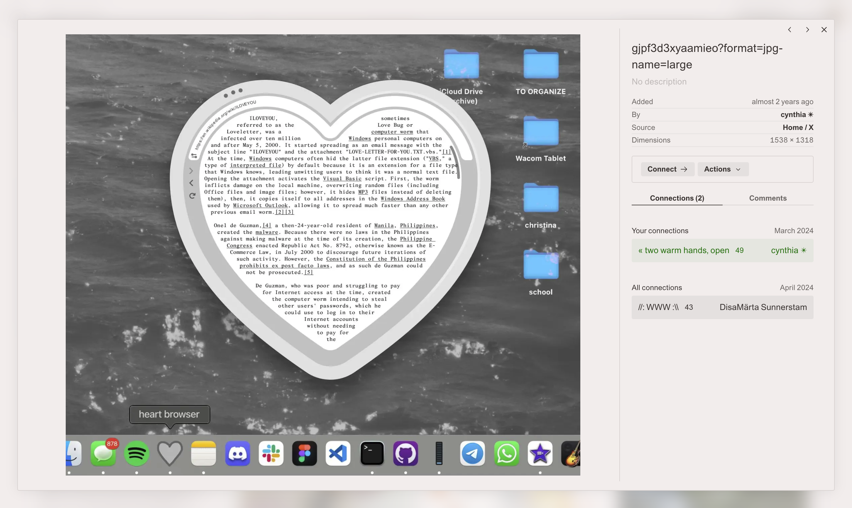
Are.na lets you connect a block to several channels, and connect those channels to others. Over time, a collection can have quite a few relationships that are hard to see on any single page.
You can follow those connections, but you have to open each page in turn. I wanted to see them together. What would a channel look like if I could move through its connections in space?
The One Decision
I kept Kabo focused on exploring a collection. Are.na would still be the place to save and organize it. That gave me a useful way to decide what belonged in the interface.
What It Isn't
Block counts, connection depth, and rankings of popular channels would have been straightforward additions. I left them out. I was designing for researchers and collectors who wanted to look through their existing material, and I didn't think those numbers would help them do that.
Kabo has no stats, import, or export. Every node links back to its original on Are.na. As you open channels, the graph adds their contents to what is already there. Keeping earlier nodes visible lets you follow a new connection without losing where you started.
How It Works
Paste a Channel URL.
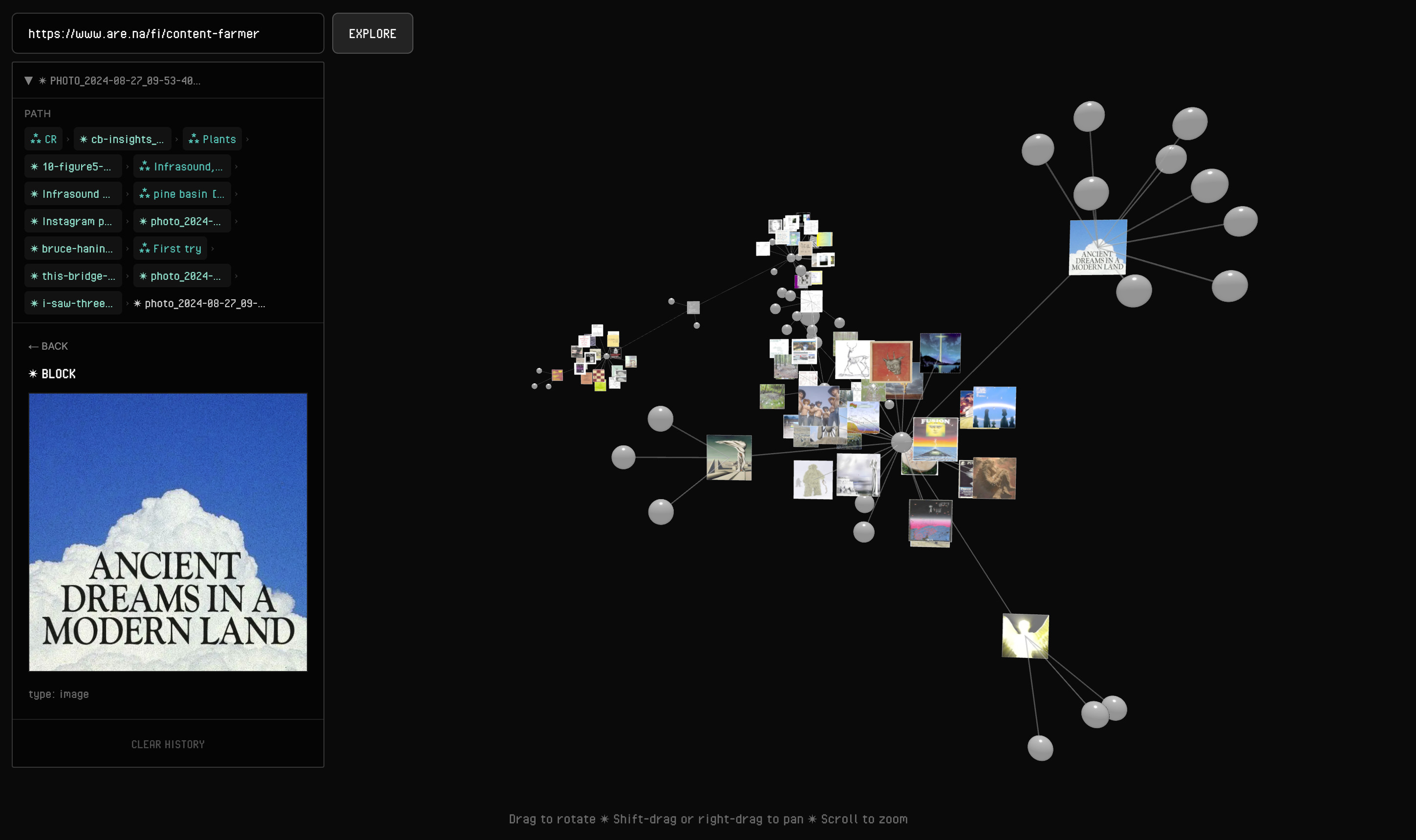
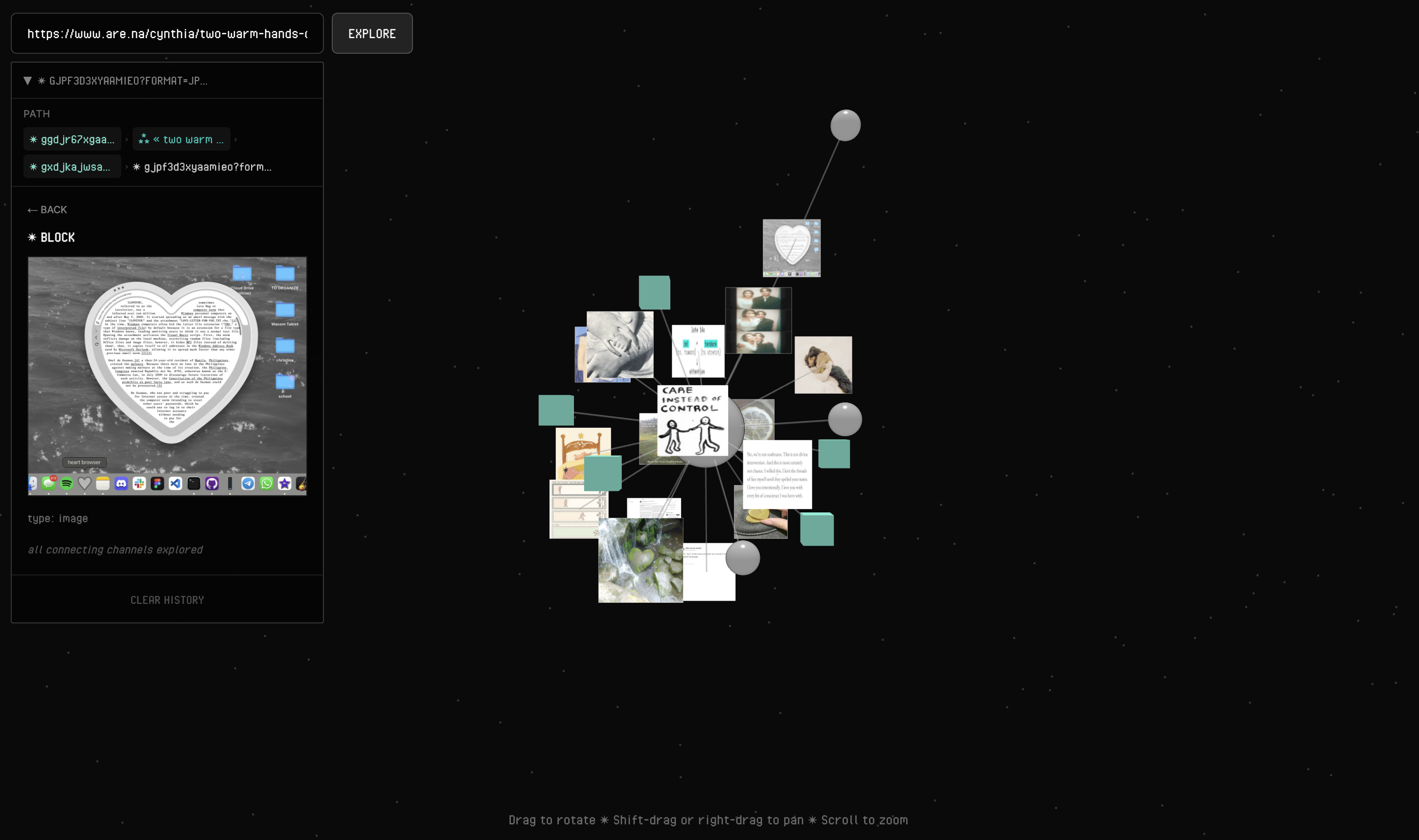
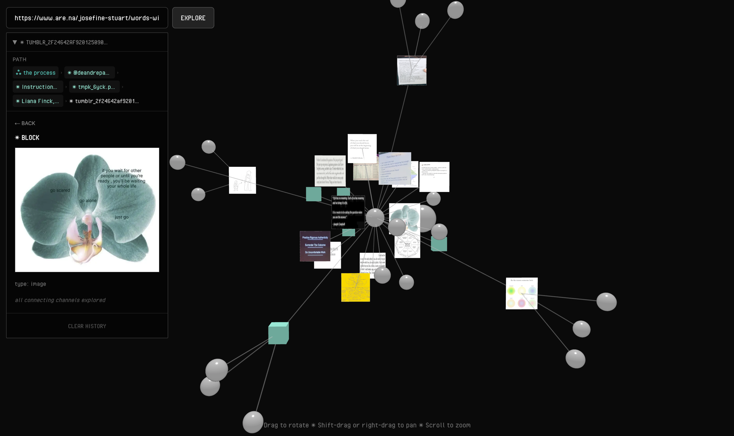
Kabo fetches the channel and draws a force-directed 3D graph against a dark background. Channels are faintly glowing spheres. Image blocks display their images on floating planes, while text blocks appear as small colored cubes. Thin lines connect them.
Click a Channel to Open It.
The channel's blocks appear around it and the graph expands. Clicking a block loads the channels it belongs to. An image you found in one channel might belong to three others, giving you another route through the collection.
Hover to Bring a Node Forward.
Small brackets around channel spheres indicate that you can open them. Selecting a node opens a sidebar with its name, contents, preview, and original Are.na link. The sidebar also keeps a trail of the nodes you've visited.
Technical Decisions
Nodes Are Built Once, Never Rebuilt.
Moving a node updates its transform instead of creating new geometry. This mattered because the graph keeps moving as you explore. Rebuilding nodes on each state change would add work without changing what they contain.
Image Textures Are Cached.
A module-level map stores textures by block ID. The first visit uploads an image to the GPU. Later visits reuse that texture. Without the cache, revisiting an image produces a visible stutter.
The Graph Grows on Purpose.
Opening a channel adds up to 20 random blocks and 5 sub-channels. Opening a block adds up to 3 channels. I chose those limits for the experience, not because the API required them. Showing 200 nodes after one click would make it much harder to understand what had just appeared.
Fetches Run in Parallel, Retries Live on the Proxy.
Independent fetches run together, and the proxy handles backoff when Are.na's rate-limited API needs a retry. An expansion can pull from several places without waiting for each request to finish before starting the next.
What I'd Build Next
A Shareable Graph.
The graph currently lives only in your session. I would put the expanded channel IDs in a URL so you could share the same set of connections with someone else. That wouldn't need a database.
Search Inside the Graph.
Finding a particular node gets difficult past about 30 nodes. I'd try highlighting matches by name while keeping the graph visible. A modal would interrupt the view I wanted people to explore.
A Real Performance Ceiling.
I haven't tested beyond 100 nodes. My expectation is that the force layout would struggle before Three.js does, but I'd need to measure that. Clustering nodes when zoomed out is one approach I'd investigate.
Touch.
The current orbit, zoom, and WASD controls don't translate well to a phone. A touch version may need a different interface, perhaps in 2D. I'd first want to understand what someone would use it for on a small screen.
What I Learned
Deciding what to leave out took as much thought as the graph itself. Tooltips, modals, and notifications all compete with the collection for attention. Keeping those interruptions out helped me stay focused on the reason I built Kabo. I wanted to see the connections and have room to follow them.