
Why Redesign
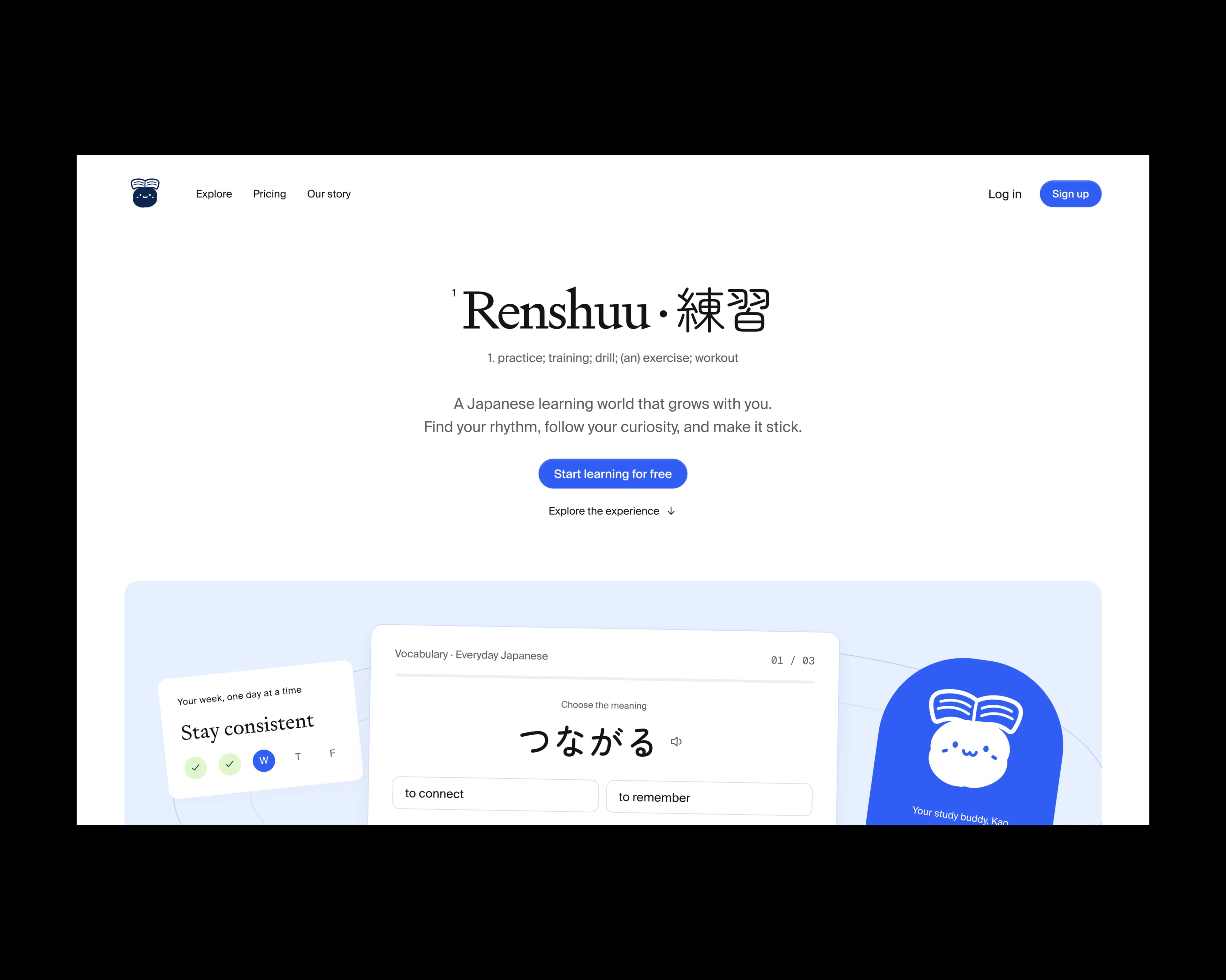
Renshuu teaches Japanese through adaptive practice, lesson paths, and optional games. Its landing page already explained a lot about the product. I wanted it to answer a few more questions before asking someone to sign up. Would this suit the way they wanted to learn? What could they do for free? When would Pro be worth paying for?
I redesigned the page around those decisions. I haven't measured its effect on acquisition or conversion, so the business outcomes discussed here are hypotheses.
Original Strengths
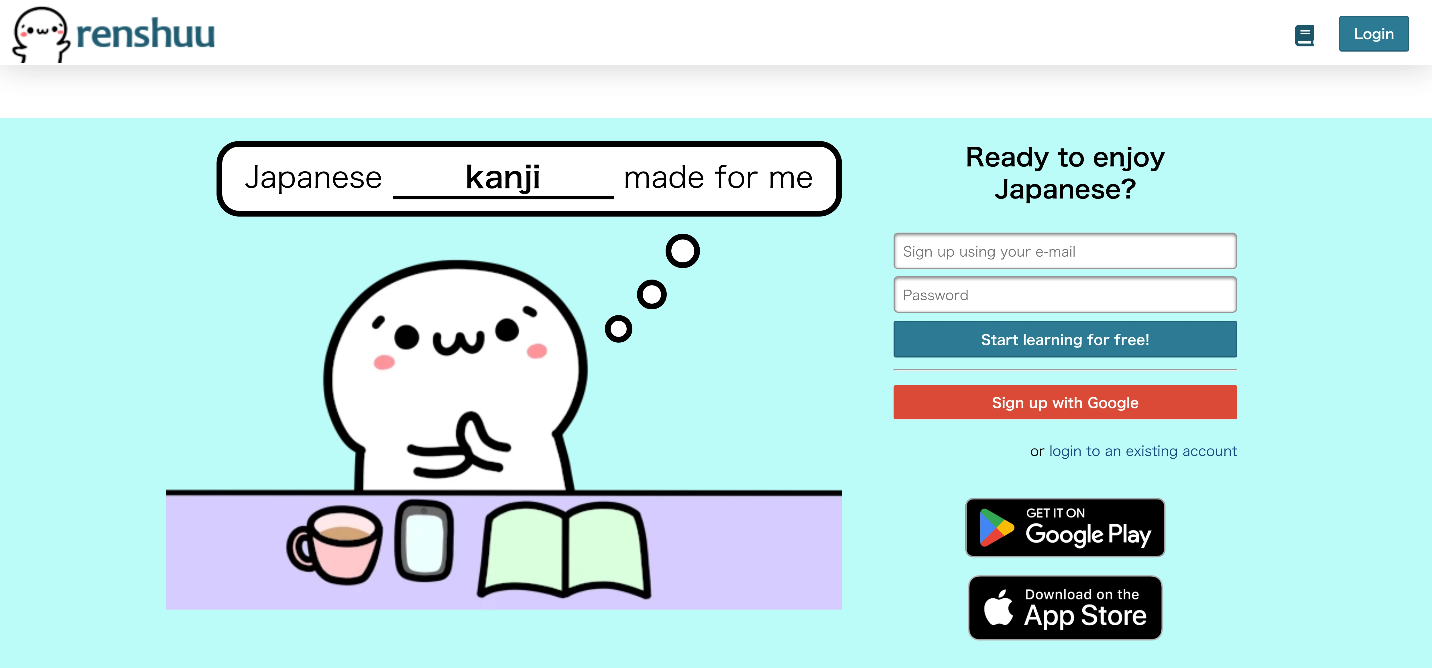
There was useful material to keep. A kanji skill slider demonstrated adaptation, and separate sections explained practice formats and lesson paths. The page also had several learner testimonials, email signup, and app downloads.
My first outline described a hero, customization, three feature sections, testimonials, and a small contact button. It helped me see the page's structure, but it didn't capture every question a prospective learner might bring to it.
Dedicated Pro and pricing sections were missing from that outline. Contact was easy to overlook, and the ending offered too little direction for someone who still needed information. Those were the gaps I chose to address.
Revised Page Structure
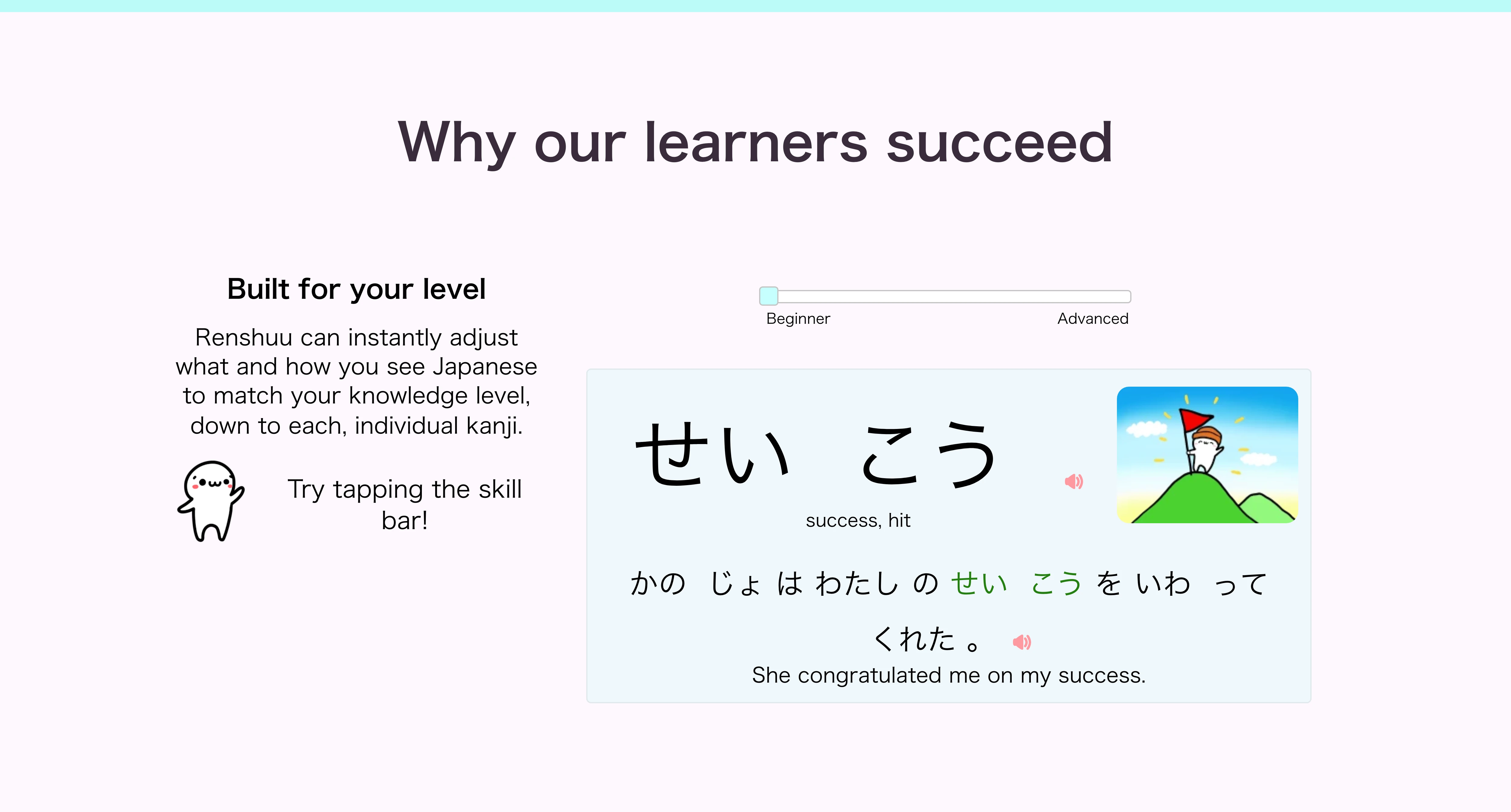
I kept the introduction and the explanation of what makes Renshuu different. Then I grouped related study tools so visitors could compare them without moving between separate sections.
Once the page had explained the product, it could address the decision to join. I followed the demos with learner stories, Pro benefits, pricing, and common questions. Contact, a closing signup prompt, and grouped footer links give people somewhere to go at the end.
Original Outline
A hero and customization explanation lead into three separate feature sections. Testimonials and a small contact button finish the sequence.
Revised Sequence
The hero and learning demos explain product fit. Learner stories provide other people's experiences. Pro and pricing explain the offer, followed by FAQs, contact, and footer links for visitors who still have questions.
The aim is to help people make an informed choice to start. A visitor who understands the learning method and free plan has more to go on when trying a first lesson. I would want to see whether they actually begin studying, rather than judge the page only by signup clicks.
Learning Demos
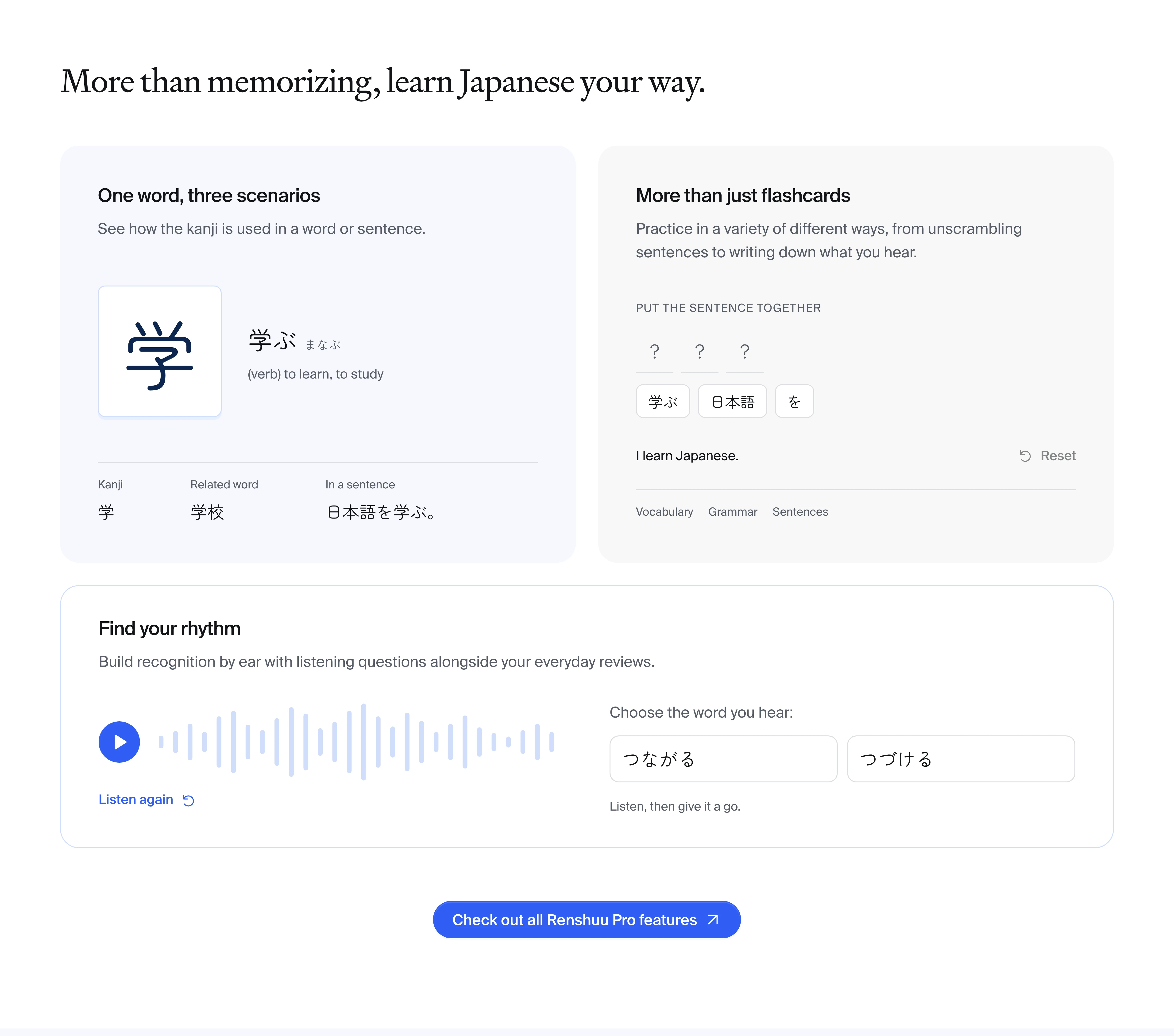
I paired a dictionary-style introduction with an interactive vocabulary example so visitors could try a little Japanese on the page. The free-start action is visible alongside it. Someone who wants to try the product can do that without first working through the paid options.
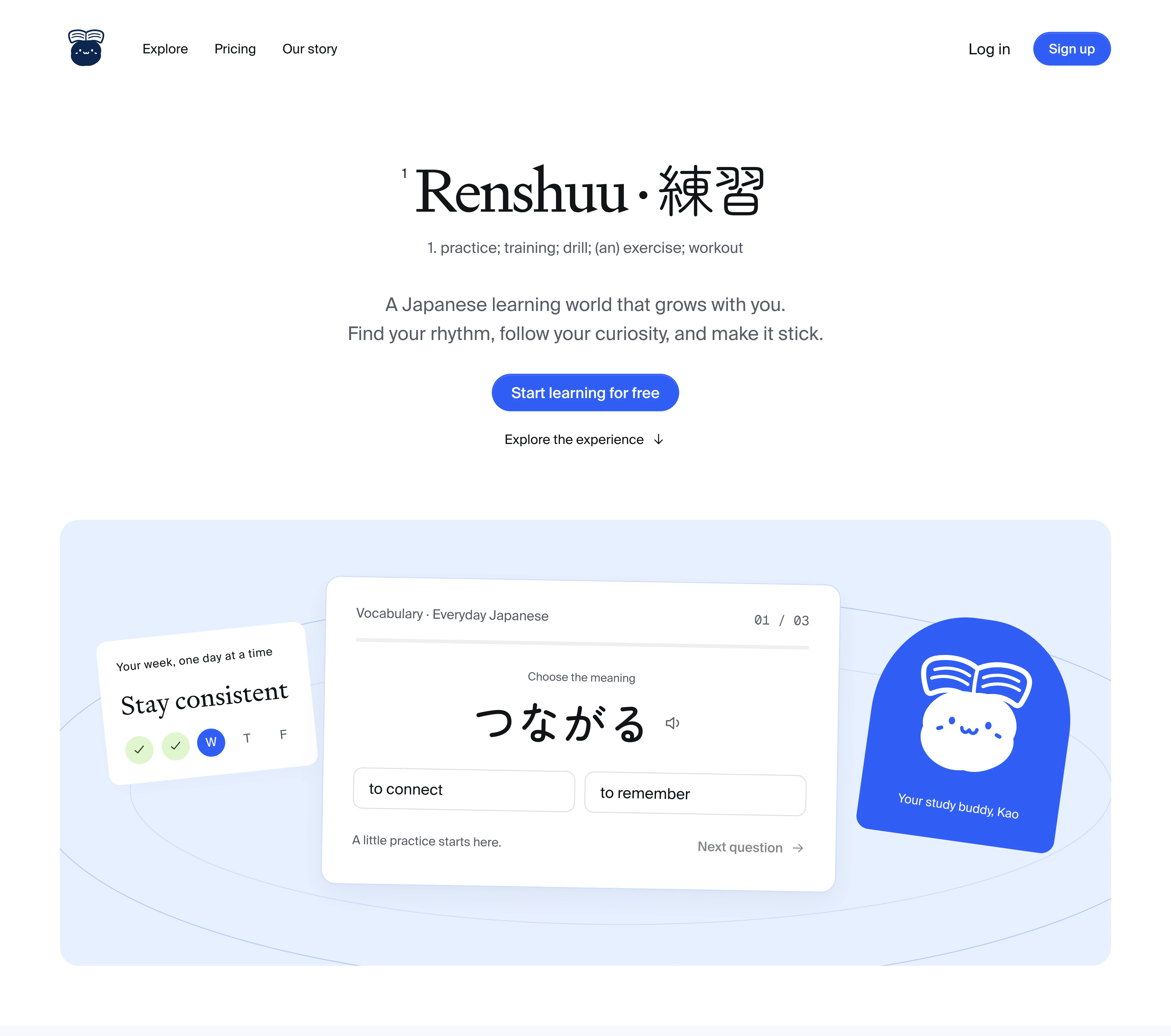
The reading-level slider keeps the original focus on adaptation. I grouped the kanji, sentence-building, and audio demos so visitors could compare the practice formats in one place. Rewards remain separate and optional. I wanted someone to be able to assess the learning tools even if games weren't part of the appeal for them.
Learner Stories and Pricing
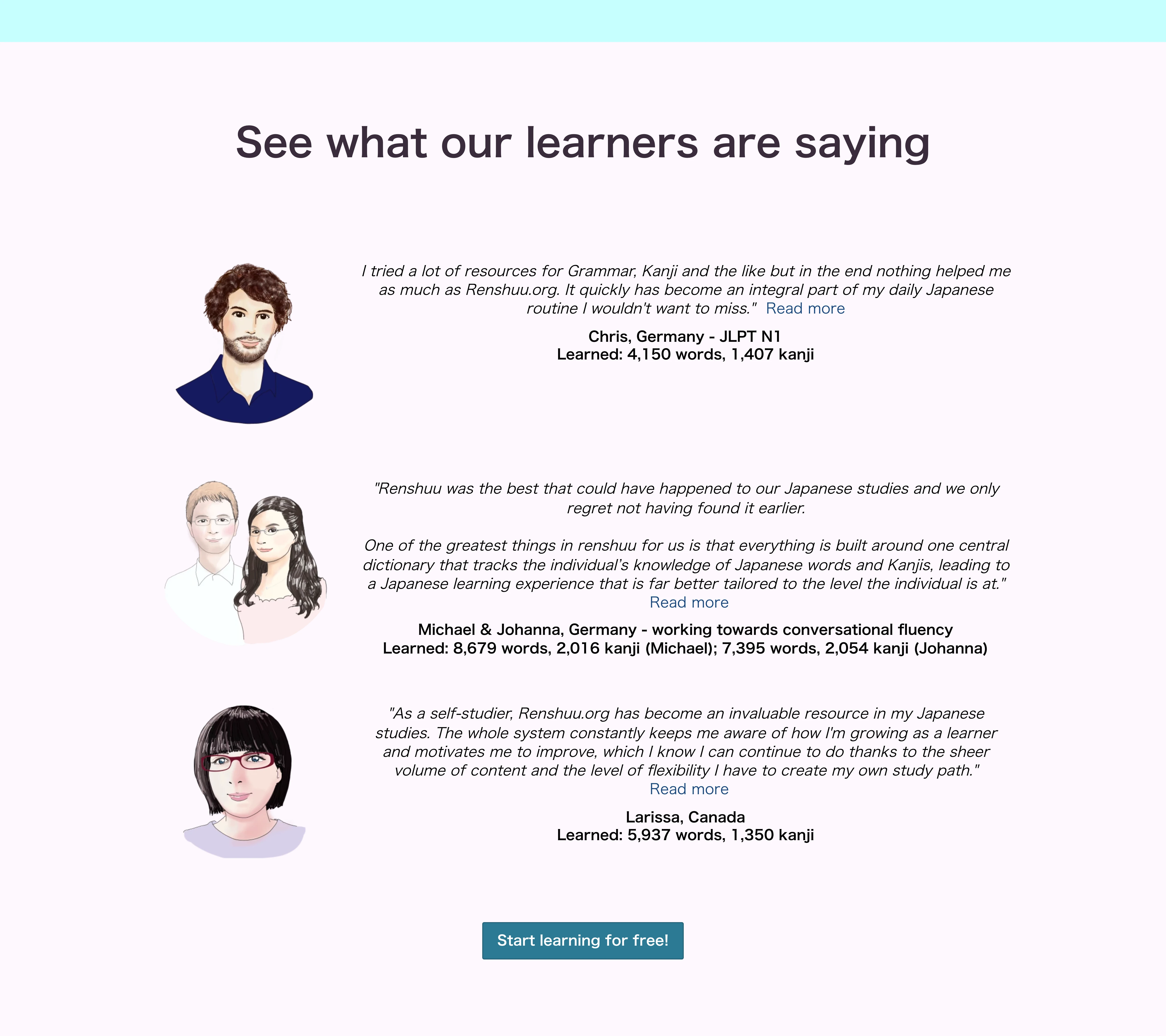
The original testimonials were worth keeping. I put learner stories in a carousel to give each one more space. That comes with a cost. Later stories are less visible, so the page can't rely on everyone reading them. Clear controls and keyboard access matter here, and essential evidence needs to be available without advancing a slide.
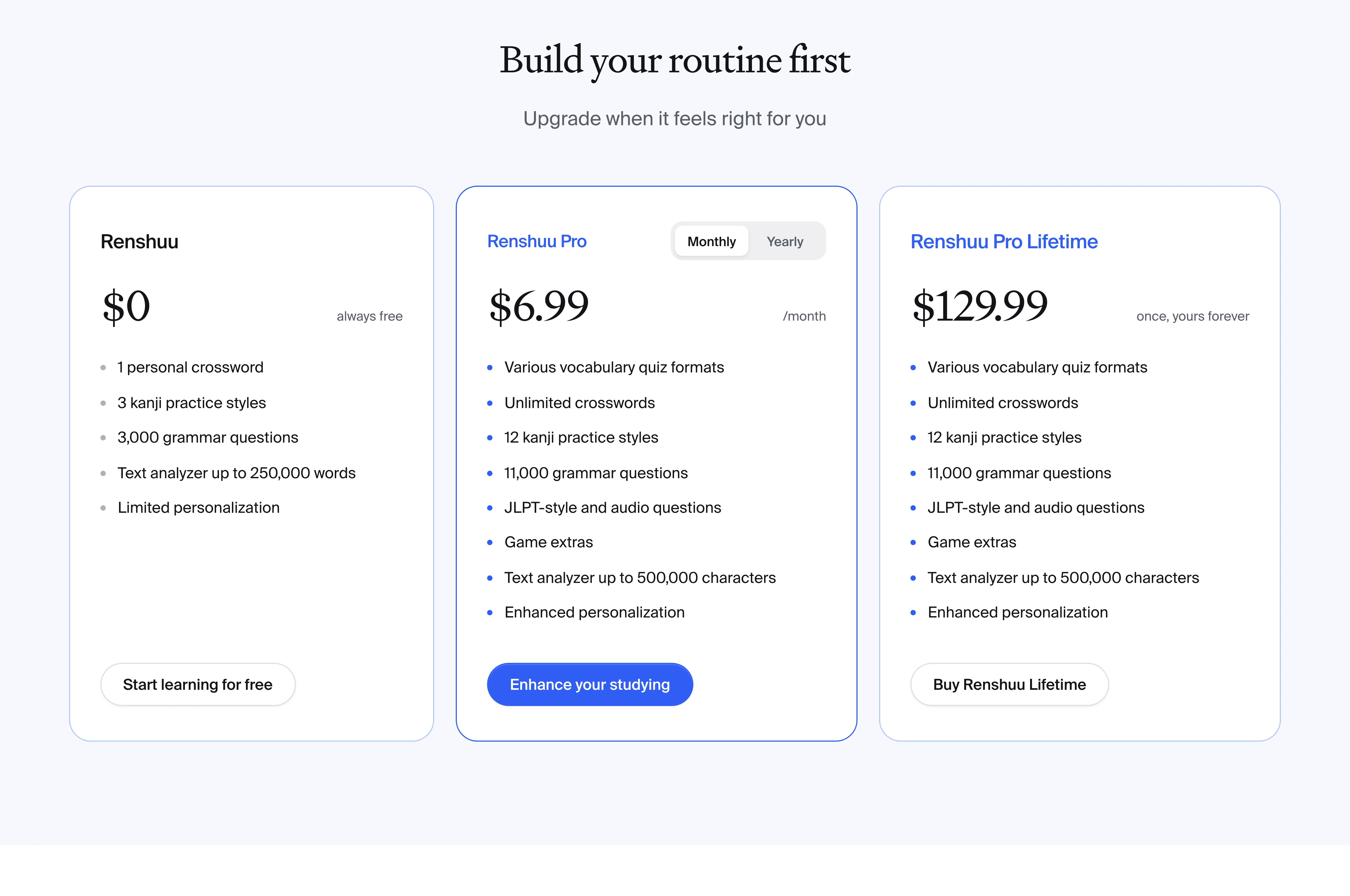
My outline called for a separate Pro section. In the implemented page, Pro appears after the tool demos, with its benefits explained in a free-versus-Pro pricing comparison. Monthly, yearly, and lifetime options let visitors assess the paid offer before creating an account.
The business hypothesis is that explaining both plans could make starting free less uncertain and help suitable learners consider Pro later. Pricing has a job beyond selling an upgrade. It also tells someone what they can expect if they choose not to pay.
FAQs and Next Steps
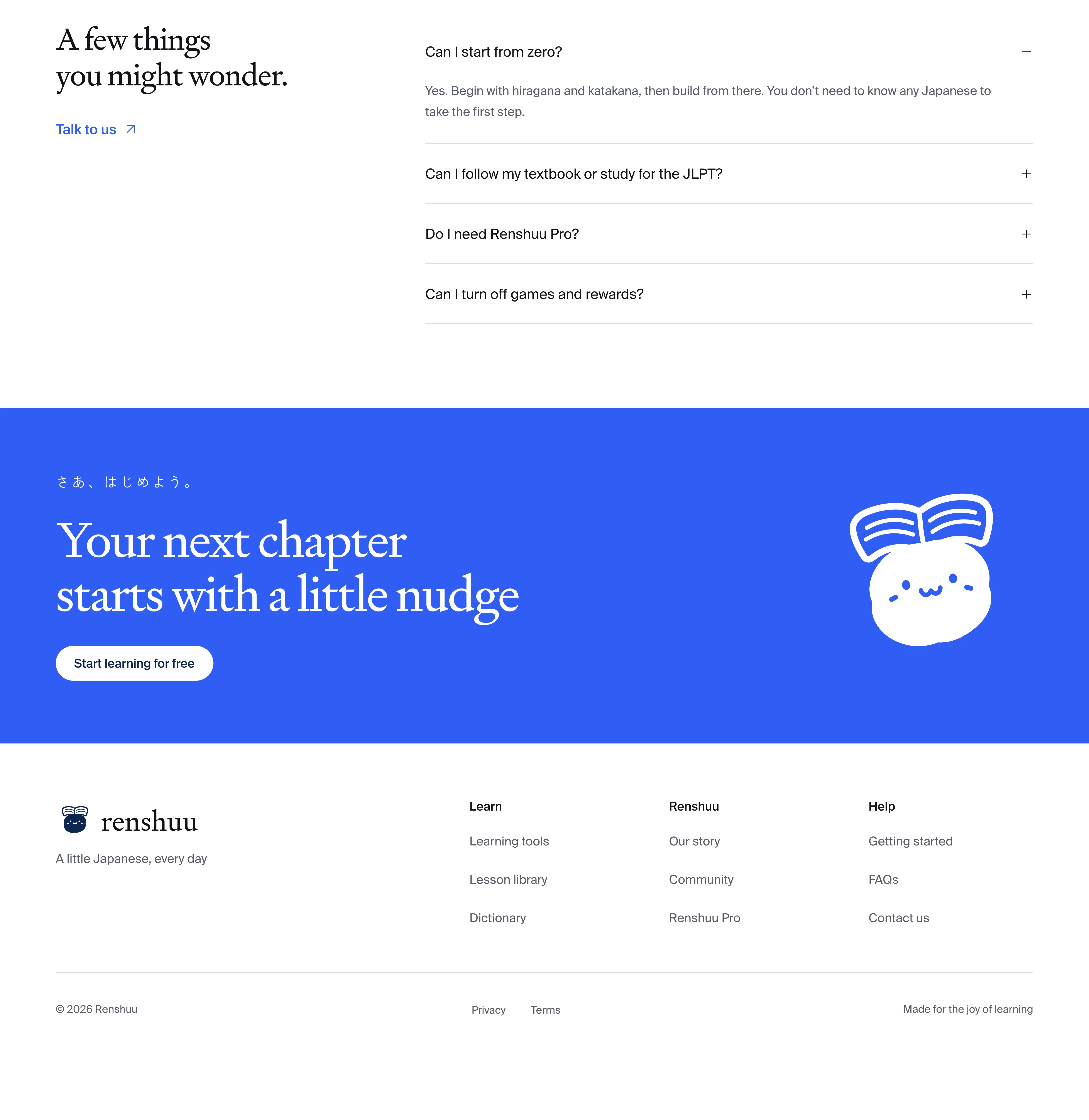
I added FAQs about beginners, JLPT study, Pro, and optional games. These are questions someone might otherwise need to leave the page to answer. A more visible contact invitation gives them a way to ask anything the page hasn't covered.
At the end, readers can sign up or use the grouped footer links to find more detail. Both are useful next steps. Someone who needs another answer shouldn't have to search for a way to get it.
Measuring Impact
I would compare the redesign with the original using similar traffic cohorts. Ideally, an A/B test would run with enough traffic to make the results useful.
- Signup completion per landing-page session would show whether more visitors become new users.
- The share of new users completing a first study session would show whether those signups lead to learning.
- Pro purchases per eligible free user over a fixed period would measure paid conversion.
- Organic visitors who sign up and complete a study session would measure qualified search acquisition.
I would also compare results by device and acquisition source, and monitor page speed, accessibility, early retention, and support questions. More signups would be encouraging, but I would want to know whether those learners understood the offer and kept studying.
Takeaways
Working on Renshuu made me look more closely at what someone needs to know before creating an account. The original page explained the learning tools, but my outline left the free and paid offer unclear. Adding pricing and FAQs gave those questions a place on the page. Grouping the demos made it easier to compare the ways to study.
That is the business case I would take into testing. Can a new visitor explain what they can do for free and why they might choose Pro? Can they find a study activity they want to try? I would start by watching prospective learners use the page, then revise the parts they still need help understanding. The redesign gives me something concrete to test against those questions.